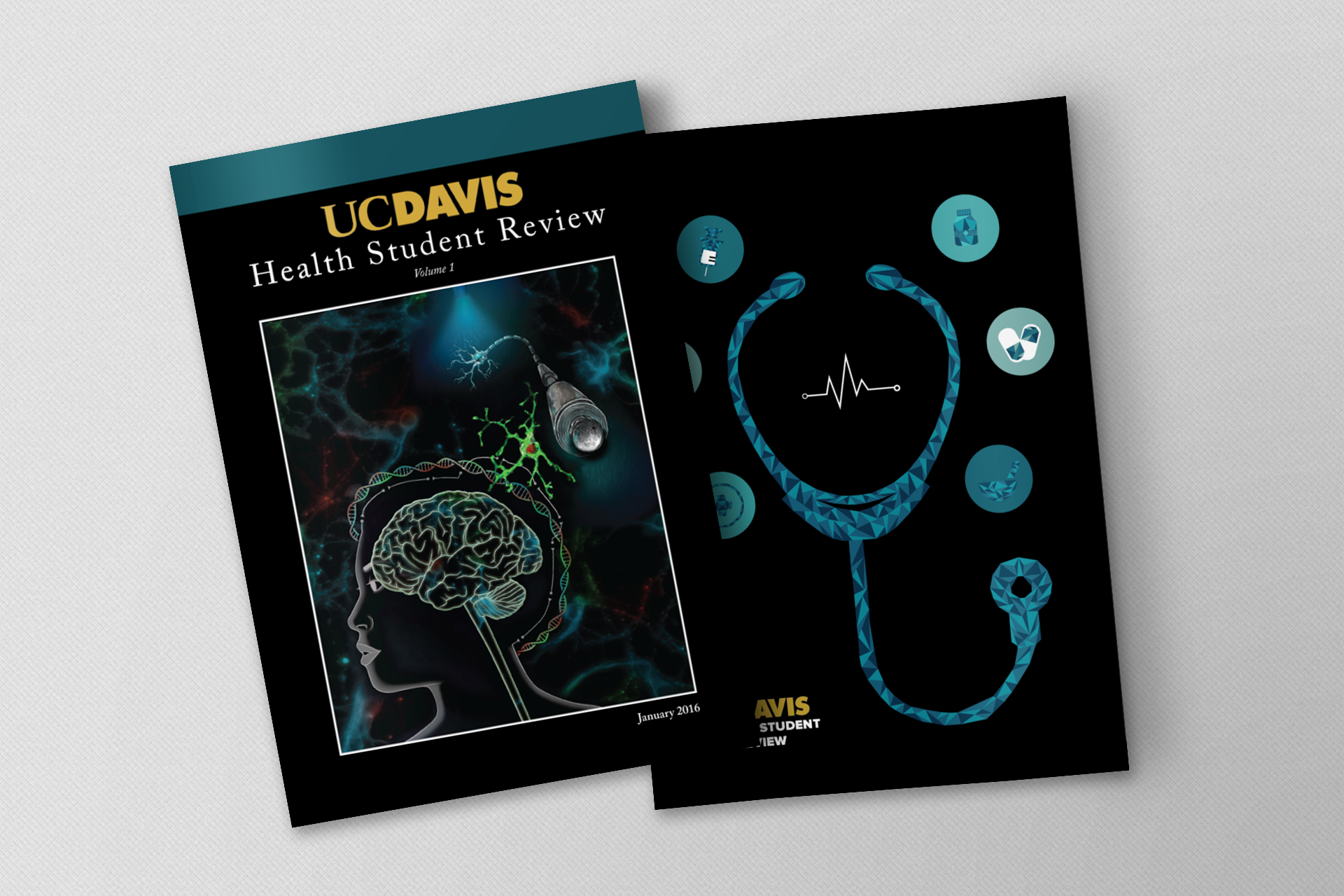
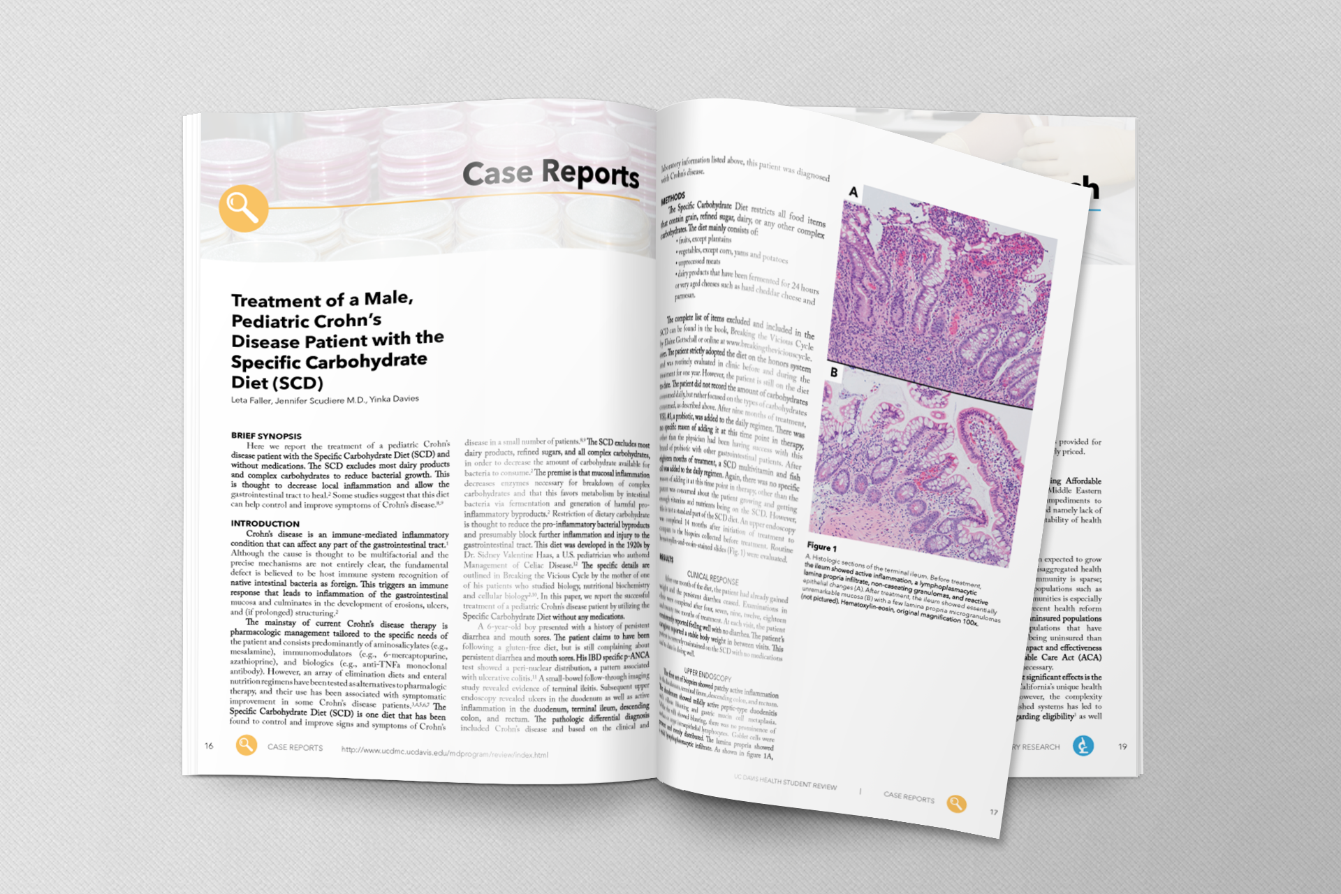
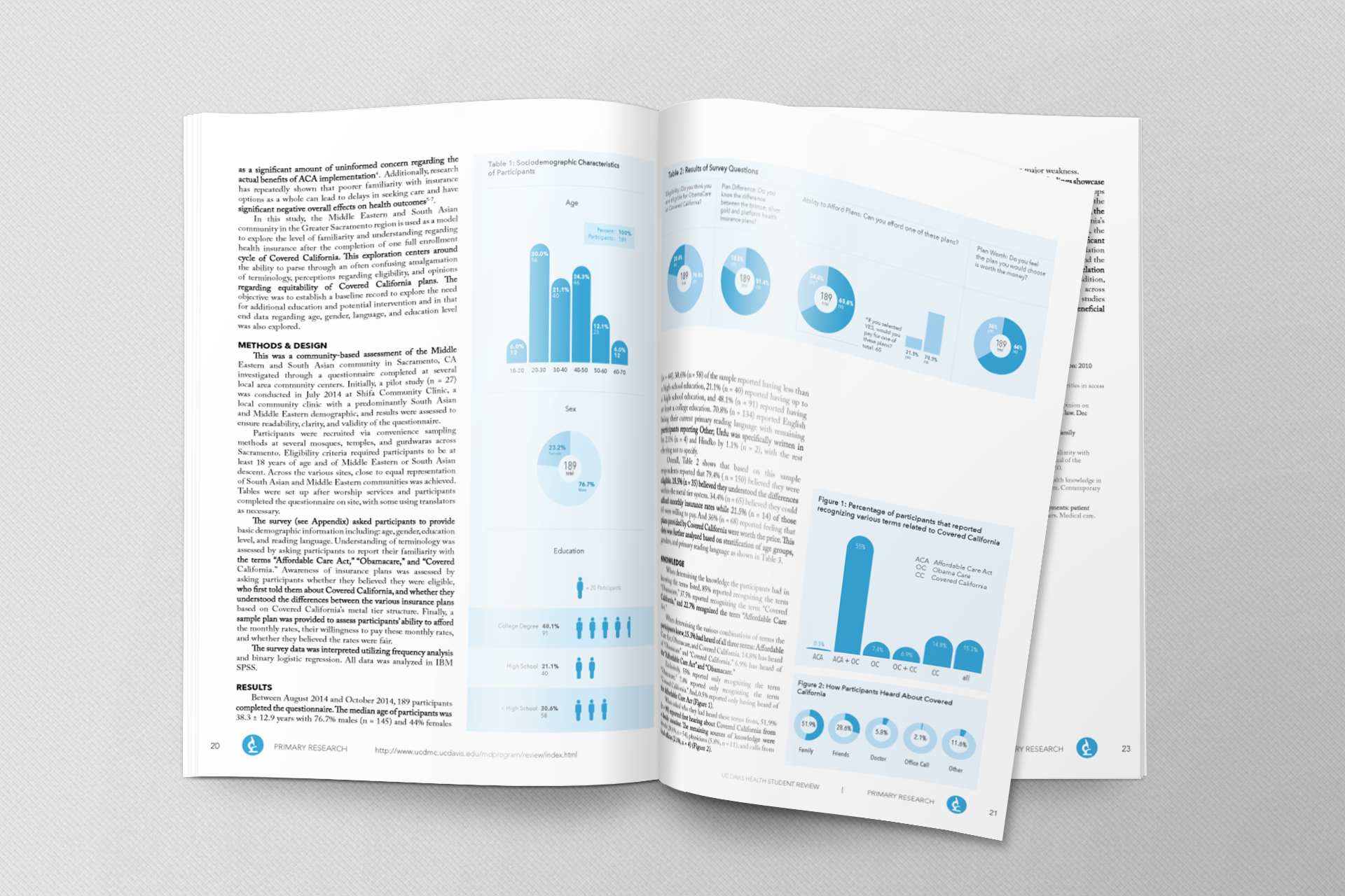
Partnering with two medical students and three designers, we curated and designed the inaugural issue of UC Davis Health Student Review, a health publication produced by and for UC Davis School of Medicine. Since this was UC Davis's first ever medical journal, the designers and I had the responsibility of creating not only the standardized magazine layout, but also the visual identity. We established the graphic standard for layout, typography, and iconography while solving complicated publication layout issues.
My team and I created both print and web material for an audience of 400+ medical students and faculty. I also spearheaded meetings and project management for the magazine's creative direction.
-
Objectives
As a journal for students by students, we hoped to provide tomorrow's healthcare leaders with an opportunity to develop the skills they need today while following in the tradition of research and clinical excellence that UC Davis has developed over the last century. I generated three user personas to gauge our target audience and what needs we could fulfill for them with this magazine. With this, our objectives were to provide a medium for students, faculty, and staff across the university to:
- Present data
- Share experiences
- Develop their talent as writers, researchers, and editors
- Provide infrastructure to foster relationships and mentorship between undergraduate, graduate, and professional students and faculty
-

-
-
Standardized Layout
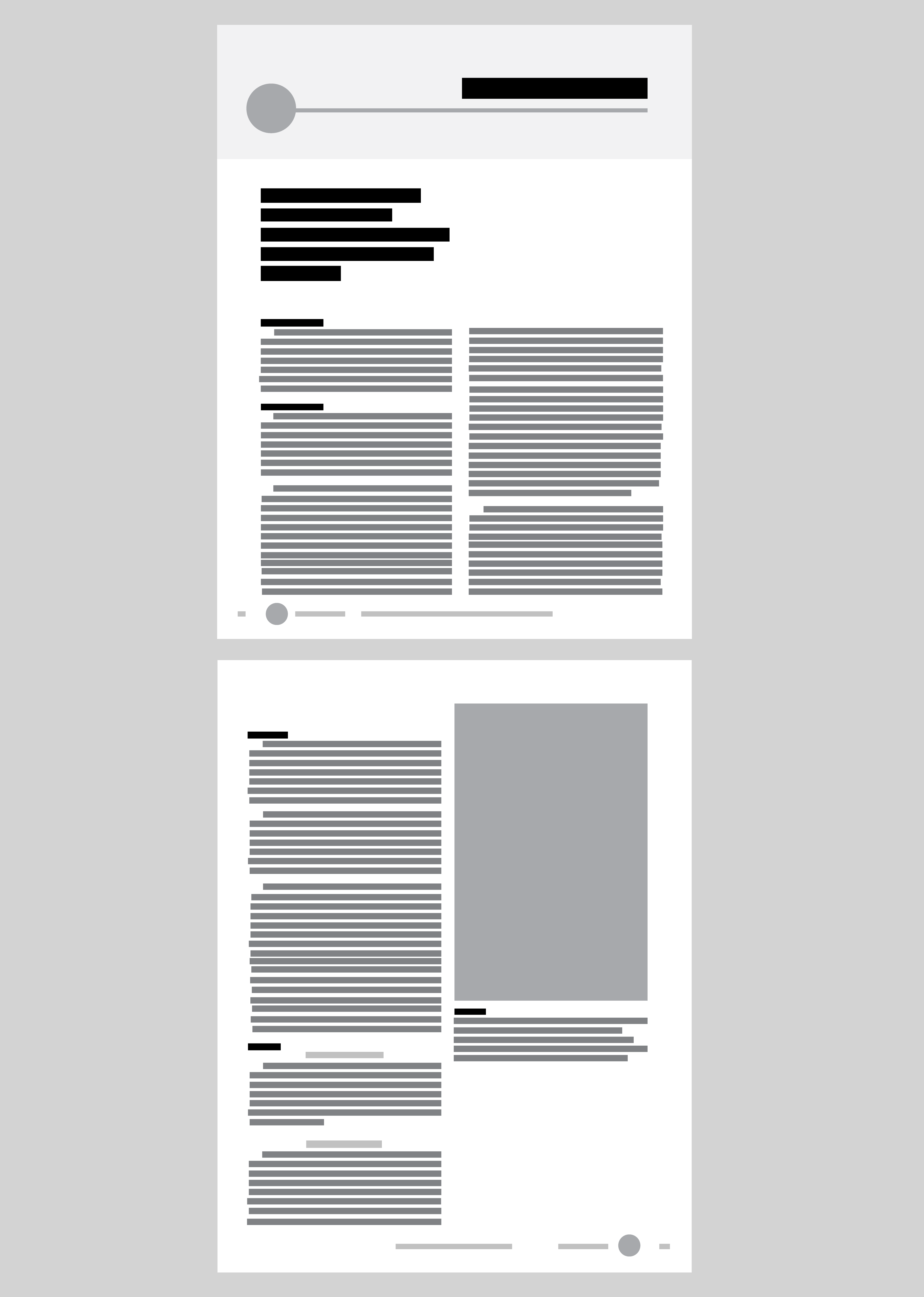
For consistency, my team and I created a standardized layout and structure that every issue of the magazine would follow. Each submitted article was sorted into categories that would help organize the contents of the magazine. I created the wireframe for a standard article to include:
- Banner. Banners stretch across full width of the page and have an image appropriate to the category with a white overlay.
- Icon. Circluar icons are present in the banner to insinuate category. Icon thumbnails are also present at the footer.
- Images. Infographics must be designed in the same categorical color as the article. Images take up full column width and are accompanied by italicized caption text.
- Body text. Article titles and subtitles are printed in Avenir Bold, while regular text and author names are printed in Adobe Caslon Pro.
- Footer. Information includes magazine title, issue number, icon category, page number, and website URL.
-
Iconography
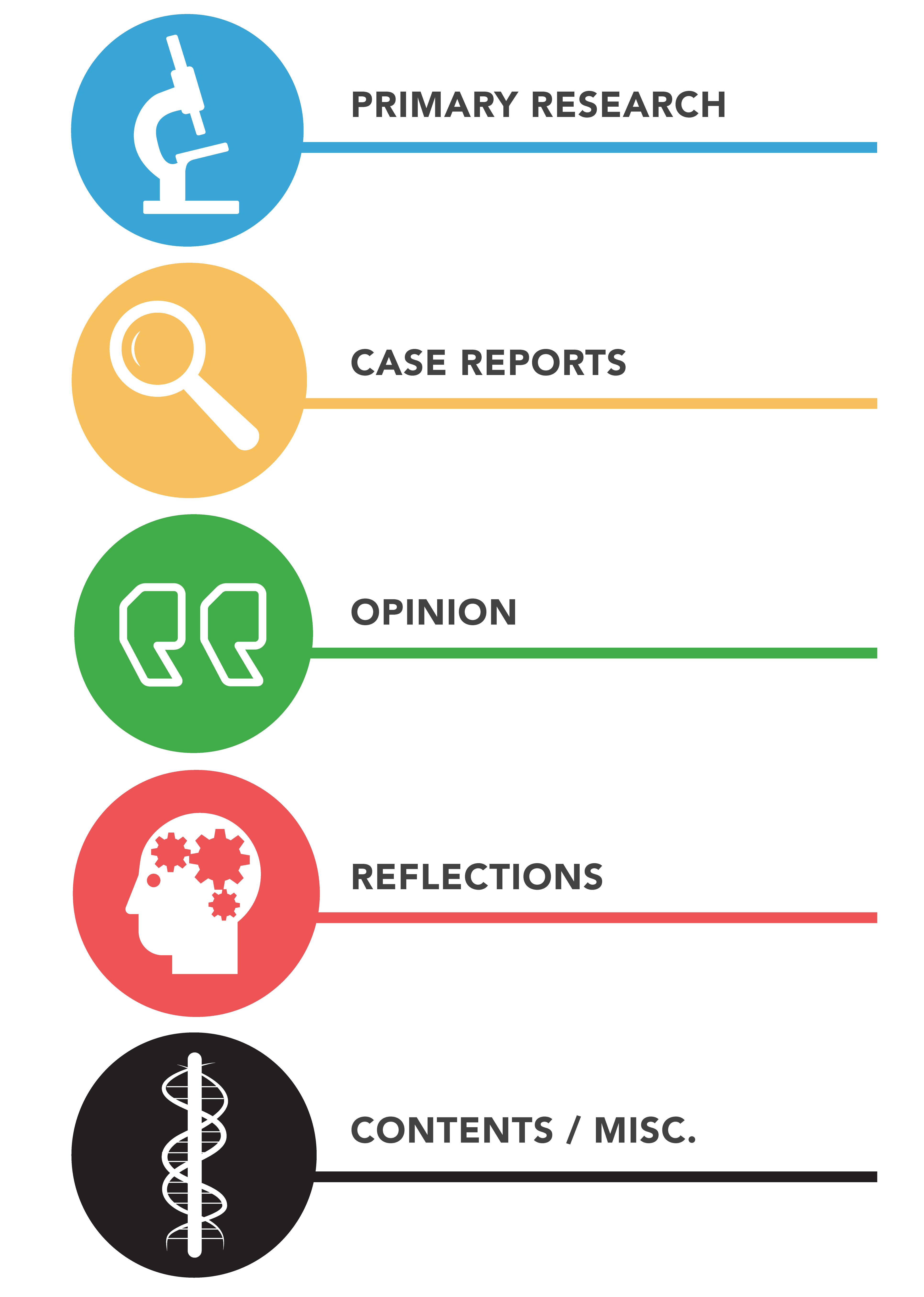
My team and I created supergraphics that would represent different categories that each article would be placed. Along with an icon design, we assigned standard colors for each category. Since the professional nature of the medical journal requires a more sterile magazine layout, we wanted to use bright and bold colors to add life. We designed the icons to have a flat, minimalist look in order to not detract attention from the content.
The article categories included:
- Primary Research
- Case Reports
- Opinion
- Reflections
-
The Inaugural Issue
The first volume of UC Davis Health Student Review features great articles ranging from the importance of pet insurance to the struggles of anorexia nervosa. We have ambitious plans for the medical journal, and plan to expand its reach to all health-related departments and schools in the university. We envision this publication as serving a crucial role in developing healthcare leaders at UC Davis.
